
Boss USA
Website redesign
Redesigning the firm’s website so that it aligns with their new policies and company values.Competition is fierce in the utility business, and most players have modern, well built websites that attract clients. BOSS USA is the one that needs to stand out.
Role
Solo design intern that helped rebrand and redesign Boss USA
Timeline
January 2022 -April 2022
Who are they ?
BOSS Technologies is an IT staffing and services firm providing innovative, high quality and best-in- class services to our clients since our inception in 1997. They have provided clients with flexible, cost-effective Utility management systems and IT staffing solutions that have enabled them to achieve workforce management goals. In 2022 they rebranded their image and chose to stick to utility management solutions as that's what they excelled in. Hence they needed a revamp for their website that was originally created in the 2000’s.
What was wrong with the existing website
The site Boss USA is pretty easy to navigate and has a really good responsive design. Although the
design has its pros the user interface looks a little outdated as it has been designed in 2016. This made the website look like it did a disservice to the firm and its services.
There were few of the overriding problem areas I couldn’t ignore after going through the website a couple of times.
They were:
-Squished content due to too much whitespace
-Old/outdated imagery
-Lack of call to action "contact us" button
-Not a responsive design ie mobile website was complete chaos
-Outdated social media handles (google plus)
Research
Being someone who was new to the company I indulged in a lot of reserch so that my design could be made accordingly.
As part of the research and to understand the motive of the company better I was in constant contact with the managing partner of Boss Usa and gathered very valuable information.
Some of the questions I asked were
1.What do you think our top priorities should be as we develop the new website?
2.When a visitor enters your website – how do you want them to feel about your company
3.What 3 words best describe your company? Pick the 1 you feel strongest about. What is your company's brand tone and personality?
4.How would you describe the site? From an organisation’s viewpoint? From a user’s viewpoint
5.What will users do on the site? What are the most important tasks? (Features and Functionality)
6.Which tasks are critical to the organisation’s success on the website
These queries helped me get a better understanding of the companies goals for the redesign
Furthermore I asked the managing partner and other employees of the company to gather information to zero in on the target audience of Boss Usa
The questions raised were on the lines of
1.What will users do on the site? What are the most important tasks? (Features and Functionality)
2.Who are the users of the site? (Primary and secondary users)
3.How would you describe the users? (User characteristics, such as age, experience, education, etc.)*
I also found the main competitors of the company in the area. After going through the websites I noted down some positives and negatives which gave me a clear Idea of what was needed for this website
They were
https://redclay.com/ - modern site with integrated colour & warmth but it has too much copy.
https://www.musiusa.com/ - navigation was cumbersome
https://www.criticalriver.com/ - home navigation was perfect but the rest of the site was not scaled properly.
https://www.esc-partners.com/ - Clean and simple but feels outdated
https://originutility.com/ - the message feels modern but the site seems "flat" with no call to action.
The Target Audience were from 2 categories
Primary: Utility Directors/Leads (public & private sector) , Project managers
Secondary: Utility Sales Partners and associates
The Pain points of the target users were
Having spent some time to analyse the data two key pain points emerged that informed the strategy that was adapted throughout the redesigning of the website.
The findings are
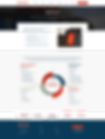
2 out of 5 times the user might find the site outdated and hence lose confidence in the company.
As the website is the face of the company, an outdated website will form an impression that the company isn't modern and will diminish the value and credibility. With a modern website the company can drive their motives and build trust in their customers.
3 out of 5 times the user might feel overwhelmed.
Even if bounce rate remains high and there is a good amount of website visits, the average user might have not found what they are looking for as there is too much content on the site. This can be solved as the new transformation defines the focus of BOSS USA and ultimately brings a redefinition to the content used.
Goals
To build a responsive, modern and user friendly website for BOSS USA some Key Goals were Identified which were,
1.Improve clarity
Decrease the time taken for navigation and for driving the first impression that BOSS is the family
2.Maintaining the trust
Maintaining the trust through being modern and understanding that the company is confident and that it can design, deliver and support solutions.
The Design Process
As the general flow of the website was already great the next task at hand was to have an overall look and feel of the project.
The visuals of the project are-

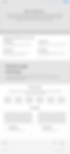
Colour
Palette
Blue & Green are often seen as a signs of stability,calm,motivation and reliability. They are calming inspiring and evoke feelings of trust and optimism. These colors when paired with red double the assurance and asserts dominance.
All this plays into the companies mission statement to be the family in which the customer can trust and that BOSSUSA is the company that can get the job done!
.png)
Typography
Droid Sans is chosen as it is neutral and has a friendly appearance. It is an optimized choice for user interfaces and is a comfortable font choice for mobile and web in menus, buttons and other screen texts.
PT Sans is chosen as it is legible and clean. This font type is usally used for information kiosks and can hence be the perfect fit for the body text and content.
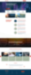
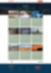
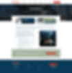
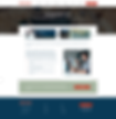
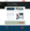
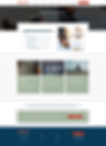
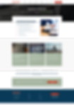
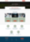
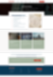
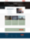
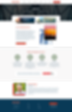
The overall look and feel of the website


We then moved on to wireframes and low-fidelities


And finally hi fidelities that were presented at their revamp launch event

.png)


Results
The company saw a huge activity when the website was launched first.As everything was structured with the user flow intact and the the ux ui revamped bounce rate also decreased to about 40 percent.
What I could have done differently
Although this was my first project that let me really work on each and every process in the ux journey thoroughly I would have loved to design responsively. As the scope was limited to web only we could not work on the mobile version for the website. With no doubt the future is mobile--or is it the present? Almost 70% of the users access sites from a mobile device, hence a call for responsive redesign would be ideal. Time constraints however proved that to be impossible.